RCA Records: Making noise with Alex Naghavi
--
Historically, record labels haven’t held the best reputation with their audiences. From straight-up exploitation to lacking transparency and withholding creative control, the sentiment is tepid at best.
Well, RCA is here to change all that. They approached us to flip the script on labels of old, and build a new direction that would set themselves up for a rich new legacy of creative contributions to the music industry. It was a resounding “f*^k yeah?!” from us.
We’re really proud of the work, so join us as Alex Naghavi, our LA-based Partner and Executive Creative Director at Josephmark, walks us through how we brought the new RCA Records brand refresh into the world, and had a damn good time doing it.
So Alex, tell us a bit about this RCA project…

RCA is the second oldest record label in the world, so they have this massive legacy…
We’re talking Elvis, Bowie, Whitney Houston, Nina Simone, Aretha Franklin, Alicia Keys, Childish Gambino, ASAP Rocky and so many more.
The thing with RCA is that it’s hugely iconic, both for its part in the cultural zeitgeist with these legendary artists, and also for its logomarks throughout history. But aside from that, they never really had a brand — it was a series of iconic logos and iconic artists. So they came to us ready to change that — reinvigorate their brand strategy, establish a new brand identity (and design system), and capture their spirit in a new brand narrative. This move was going to mark their role as cultural tastemakers in the industry, and position them to take on the next 100 years of artistry. So suffice it to say, Meghan Armstrong (our immensely talented Brand Lead on the project) and I, were ready for the challenge.
Speaking of challenges, what do you think the biggest challenge was on this project?
That it wasn’t just a brand refresh — it was to evolve RCA from a one-dimensional record label into a conduit for global cultural transformation. To make people love RCA as much as fans love their artists.
That and the logo…
Oh, tell us about the logo!

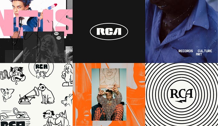
Do you know the RCA Victor logo? You know the one of the dog looking at and listening to a phonograph? It was created in 1898! It’s iconic, you’ll recognise it as soon as you see it. Then the brandmark evolved to the “lightning bolt” circular stamp in the 1920s, and then of course to the bold minimal type-forward lettering you see today which was used first in the 1960s and revived in 2015…
Our job was to determine whether we should move away from this iconic mark or go in a different direction. A daunting challenge — we know! We explored hundreds (and I literally mean hundreds) of concepts — some were super wild, and others were a riff on the current mark. Despite the very alluring proposition of being known as the designers behind the new RCA mark, we ultimately decided to trust our instincts and stick with the type-forward version of 2015 because it held so much brand equity and cultural resonance that it would be unwise to replace it. Especially because that extra-bold, custom sans-serif font was the only element in the existing brand’s visual identity.
We did some fine-tuning for balance and symmetry to enhance its timeless quality, and it just worked. We also didn’t throw away all the logo concepts — we ended up utilising them as “remixes” within the brand to not only help give new life to the brand, but provide more playful extensions within the brand system. This felt very apt to the defying personality RCA wanted to evoke. What’s more defying than not following the rules?
Onto the brand narrative…
Yes, this part was really fascinating. When RCA came to us their name was an acronym that stood for ‘Radio Corporation of America’. Exciting, huh? Look, it served its purpose for many years, but it was really our time to shift the paradigm and give new meaning to the letters RCA.
It was essential for the RCA brand to represent more than just musical artists, and instead imbue the spirit and culture of artists more broadly, like visual artists, graphic designers, photographers, animators, illustrators, stylists, and fashion designers.
So, we came up with: Records. Culture. Art. — an embodiment of RCA’s mission to defy everything you know about music labels, and represent so much more than music.
*whispers* I’m really proud of us for that one…
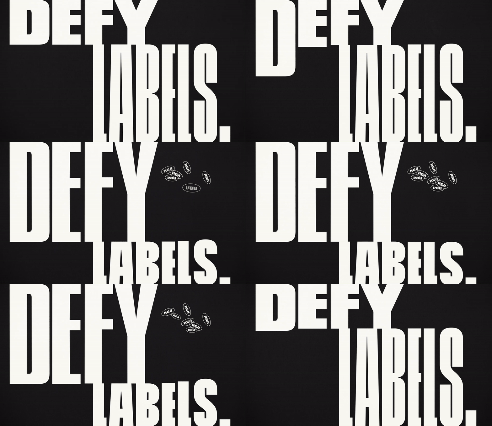
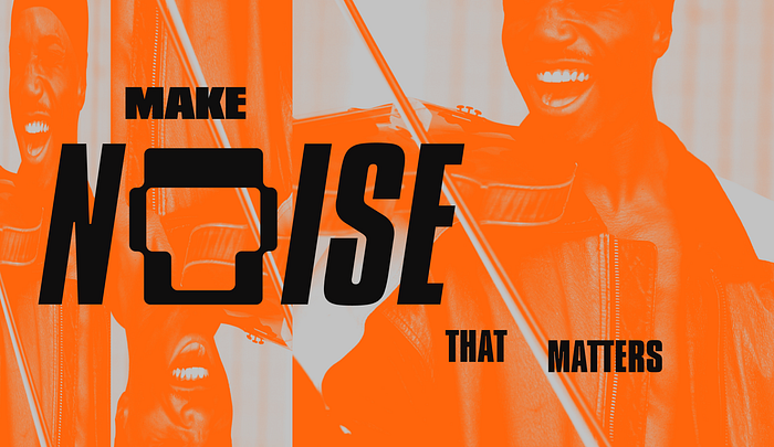
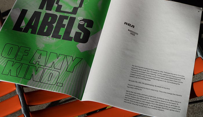
To capture the defiant, passionate and pioneering narrative of the new RCA, we wrote a rousing manifesto to unite employees and artists around the new acronym and set a new horizon for the brand and the business. Taglines like “Defy labels,” “More than a record label,” and “amplify voices that deserve to be heard” were woven into the website and marketing assets to reinforce our narrative.
What about the visual identity?
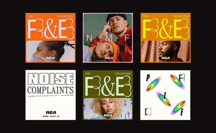

Well, just like the visual arts, music is a universal language. A cornerstone of human experience and expression that bridges cultural divides, and gives us a safe refuge to explore our own emotional reactions to living.
Taking inspiration from the vast and varied spectrum of emotional reactions people have to music and our brand personality traits — defiant, passionate and pioneering — we created a boundary-pushing aesthetic that breathes new life into a bit of an old-school business, with experimental graphics, arresting imagery, variable and eclectic typefaces, interactive elements and colours that feel really unexpected for a record label like RCA.
The result evolves RCA from a traditional record label to a culture catalyst; a brand that speaks to and reflects the diverse artists of the future and one that can live proudly as part of the cultural zeitgeist.
The type really caught my eye…


I wanted to talk about that! The type palette is an irreverent, eclectic mix, with bold headlines inspired by classic album art of the 60s, 70s and 80s (Compacta and Cinderblock), a sleek and classic serif with a bit of personality (Panama), and a workhorse sans for body copy, subheads, and digital applications (Suisse Intl’.). It’s a well-rounded suite to cater to any voice: classic and subdued, or bold and loud. They pair well together, while also giving RCA distinction in the market.
But it wasn’t until we landed on the more future-forward typefaces, Glyphworld and Phase, that the whole brand started to come together. This was our “a-ha!” moment and a super pivotal point in the project. The addition of these fonts allowed us to add more visual interest and complexity to the brand world. Phase in particular is a variable typeface, which you can see is put to good use as a “musical typeface” on the website homepage. The mixture of these in combination with the base palette allows for wild and experimental type treatments that feel sculptural, artistic and unexpected.
Overall, the type system is a key part of enabling RCA to forge its own path and identity — reflecting the new non-conformist, creative and defiant personality of RCA.
So we (JM) did a full brand rollout too yes?
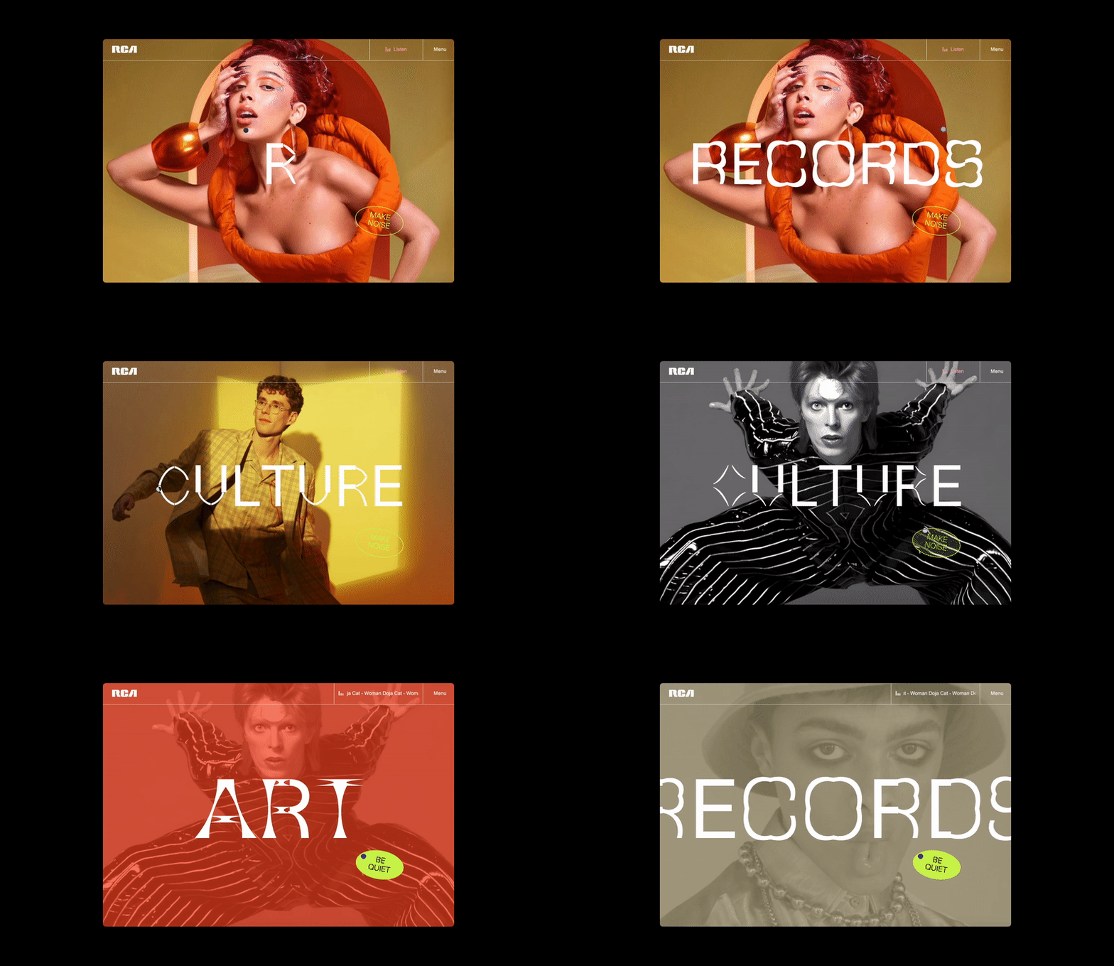

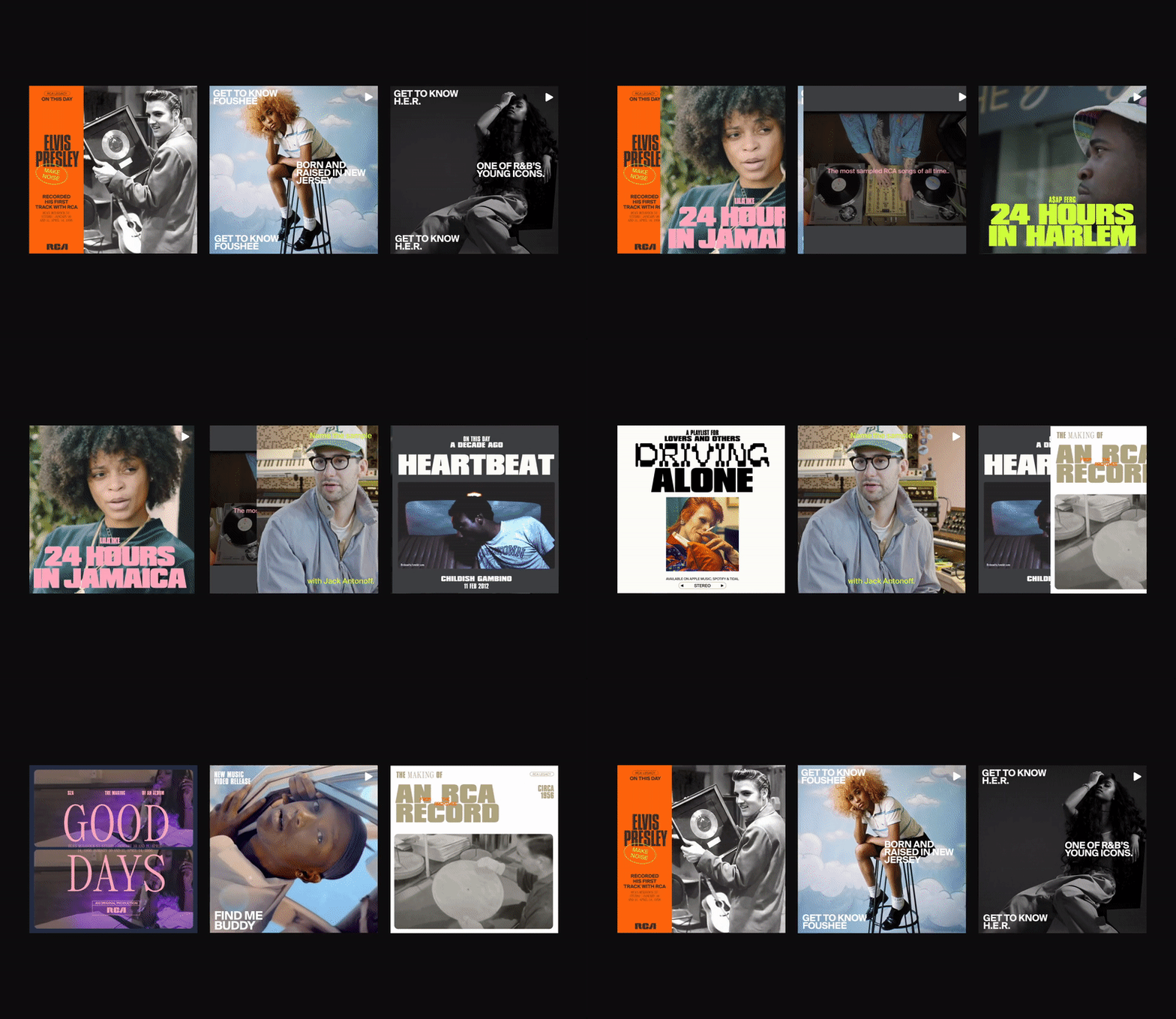
We did! When it came to the website, marketing collateral and merchandise we really wanted to capture the energy and spirit of this new brand in creative and experimental ways — even if that meant doing things that felt contrary or unexpected — that was the point. We didn’t want people engaging with this brand to know what was coming next.
Using the new acronym, “Records. Culture. Art.” as a kind of guiding ethos, the website design and build integrated motion, interactivity and experiential elements, giving real dimension and movement to the brand.
We’ve been known to hide easter eggs on 404 pages, a signature JM move at this point (ahem Myspace, Language Media), tell us about this one…

It’s one of my favourite moments! We designed a witty appropriation of the Roland SP-404 beat sampler, where you can interact with the page and mix and match beats to create your own track. It’s so much fun. I’ve literally spent hours playing with this thing — it’s kind of addictive.
Like most of the fun 404 pages we’ve created in the past, it wasn’t something RCA asked for (haha), but boy were they tickled pink with it. We find it creates a point of discussion and adds a little surprise and delight in typically boring parts of the site—it shows to our audience that we care about their experience and want them to have a good time.
Any final thoughts, Al?

I just think we’re at a truly pivotal point in the history of music, where brands like RCA are perfectly positioned to defy the traditional record label norms, and design a future we know all artists deserve. This work really reflects their connection to 21st-century audiences and artists, and welcomes everyone to participate in the revolution. We’re so proud to be a small part of defining their new legacy.
If you’d like to reinvent your brand and disrupt the status quo, we’d love to talk. Head to JM’s website to reach out.
Want to see more? See our full case study for this iconic brand refresh.
